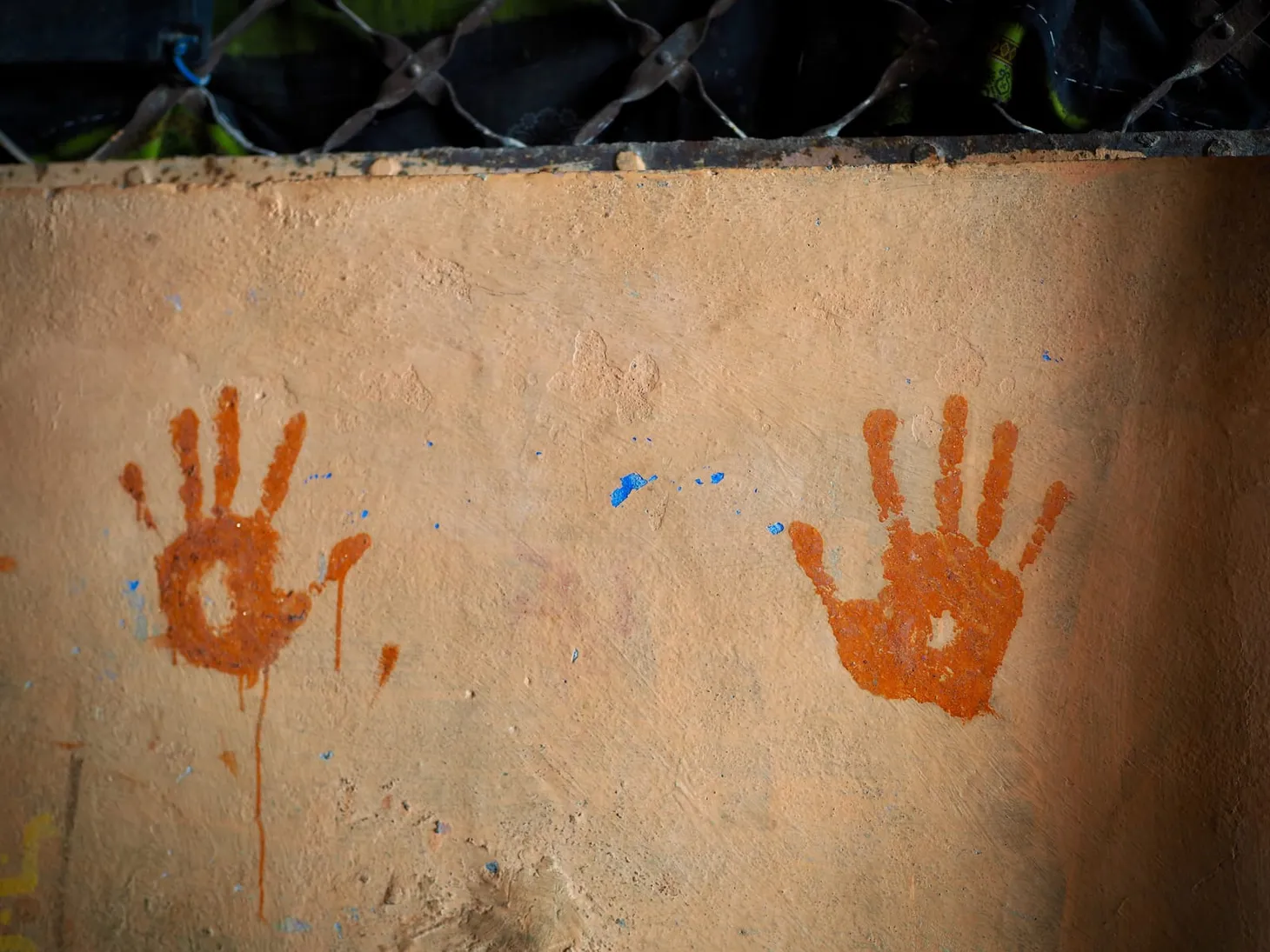
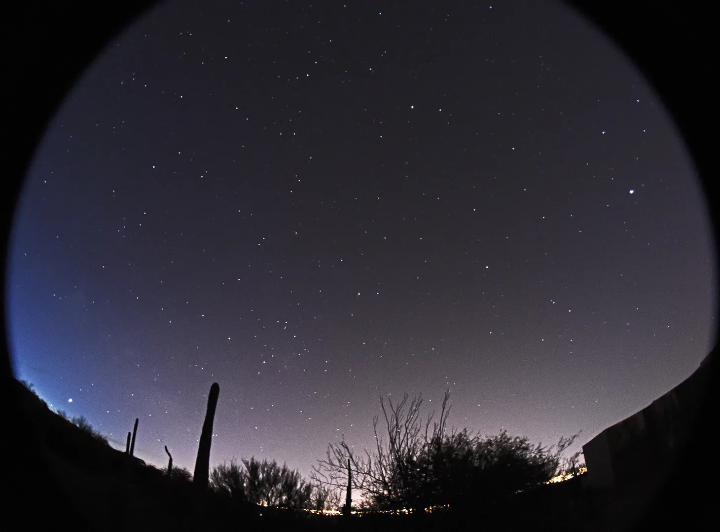
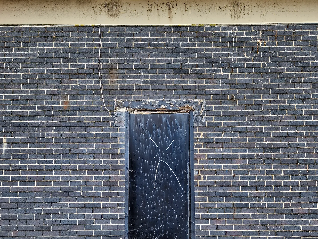
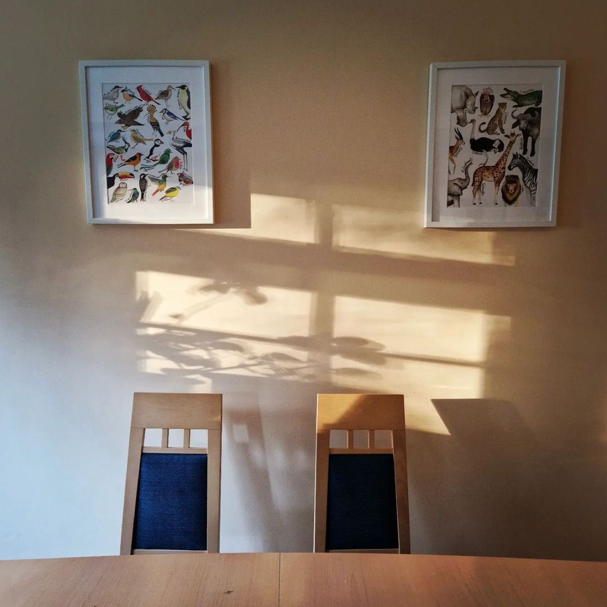
Terribly Composed Photographs
Rule of Thirds. Golden Ratio. Leading Lines. The conventional rules are geared to work well for a certain palette of stories. But what if you want to tell a different story?
Hello Good Lookers,
I've been exploring the work of Justine Kurland recently, after coming across her in this list (a Twitter thread) of woman photographers. Then I read a stark comment about one of her images: "An absolutely terribly composed photograph!"
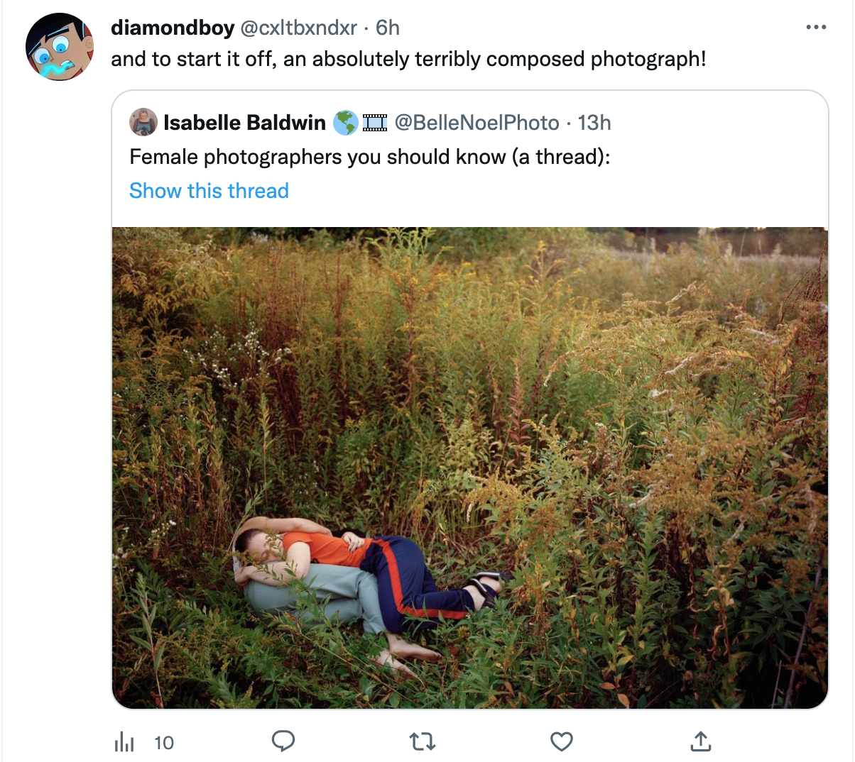
It got me thinking about what the conventional rules of composition are, and which ones this image is breaking.
The two subjects are super close to each other - a problem known as a "merger". But in this case that seems to be the point: the girls are merging. The image is from Kurland's iconic Girl Pictures and while the photos look very natural they are actually staged, so we know that the merging (and other compositional errors) are all intentional. The question we're exploring here is: "Why?"
In case you're new here - I'm Menka, and you're reading a Just Looking Letter, a monthly-ish newsletter about mindfulness, perception and perspective. It's a project supported by the Friends of Just Looking, which you're welcome to join. Each letter has a theme, and this time it's terrible composition.
About Composition as Storytelling
Last night my husband and I were sitting on a high-rise balcony, watching the sun set on the city. Even though our bodies, heads and eyes were facing the same direction, our visual attention was tuning into wildly different information. (Him: dusky pink hues bouncing off glass buildings. Me: commuters.)
Each human eye gives us roughly a 120-degree field of vision on the horizontal plane and 60-75 degrees in the vertical plane. With both eyes together, we can see much more than that. That's a lot of information.
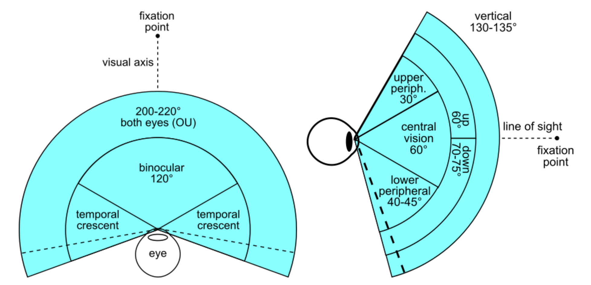
We simply can't take in everything within this immense visual field. Choices are constantly being made, and it's personal. Just as our own names are prioritised in our auditory attention, certain sights are prioritised visually, depending on our needs and interests. Architects notice buildings, bird lovers notice birds, toddlers notice chewing gum stuck under chairs, and so on.
In photography, the purpose of composition is to place objects within a frame to guide a viewer's attention in a specific way. To take viewers on a visual stroll. To tell them a story. Humans, non-humans, dark, light, and colours are like notes on a keyboard. There are many ways to place them, and many stories to be told.
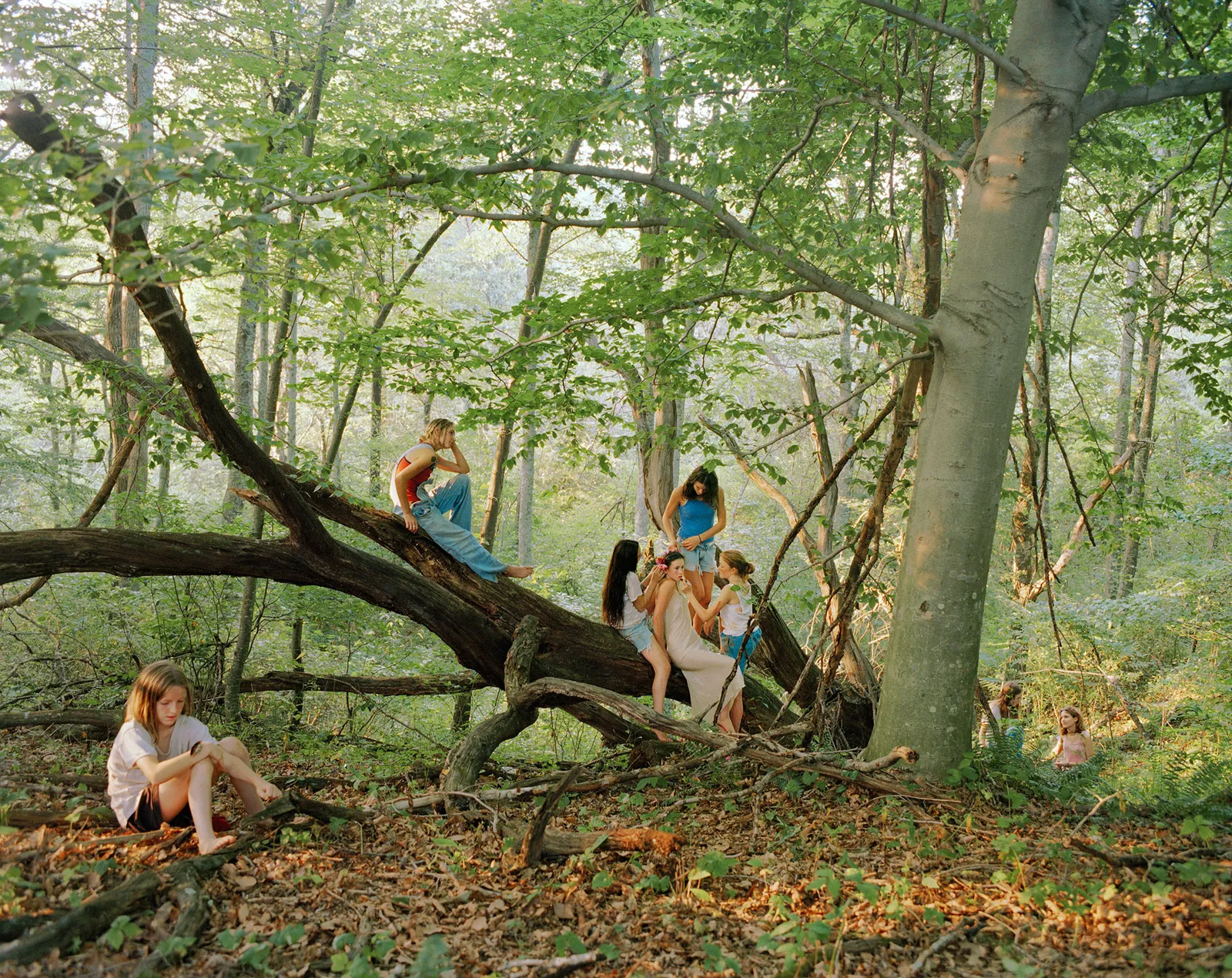
The conventional rules of composition tend to work for a certain palette of stories. Keeping subjects at a distance from each other, or ensuring there is plenty of negative (empty) space around the subjects, for example, allows the viewer to focus on the subjects, with a sense of clarity and balance.
But what if we want to convey confusion, imbalance, emptiness or intimacy? That's when we need to bend or break those rules.
"Beautiful light, an unusual angle, or an interesting shape can transform the most banal situation into a compelling moment."
- Eleonore Simon, street photographer
This is not to say that there is no such thing as "terrible composition". But perhaps the most terrible thing about a composition is when we follow rules at the expense of seeing and telling our own stories.
Looking Exercise
Use a wider lens
For many of us these days, the Portrait Mode in our smartphone camera is our best friend. This uses a 2x or 3x zoom telephoto lens, which is fab for focusing on just "one thing". Blurring out the background adds to the effect, creating a beautiful image that guides the eye exactly where to go. But it also means as photographers, we don't have to think too hard about composition.
Most will also have a wider camera lens on our smartphones, which is used for group shots or landscapes. This broader perspective (in a way) reflects our everyday, ordinary, field of vision more accurately. The photographer Sean Tucker suggests using a wider lens exclusively for some time as a way of improving compositional techniques.
Testing this out myself, I've found a wider lens makes me more self-aware of the choices I'm making. Not whether it's "good" or "bad" but whether the composition helps to tell the story I'm noticing in the scene.
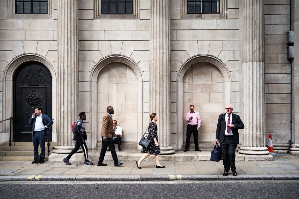
If you try this out, I'd love to see some of your wide-angle ordinary life photographs on the community Instagram. Just use the #wearejustlooking.
Links about Looking
Five things I found worth sharing this month:
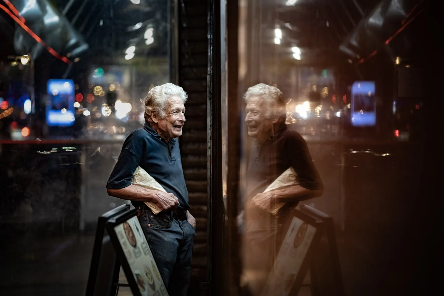
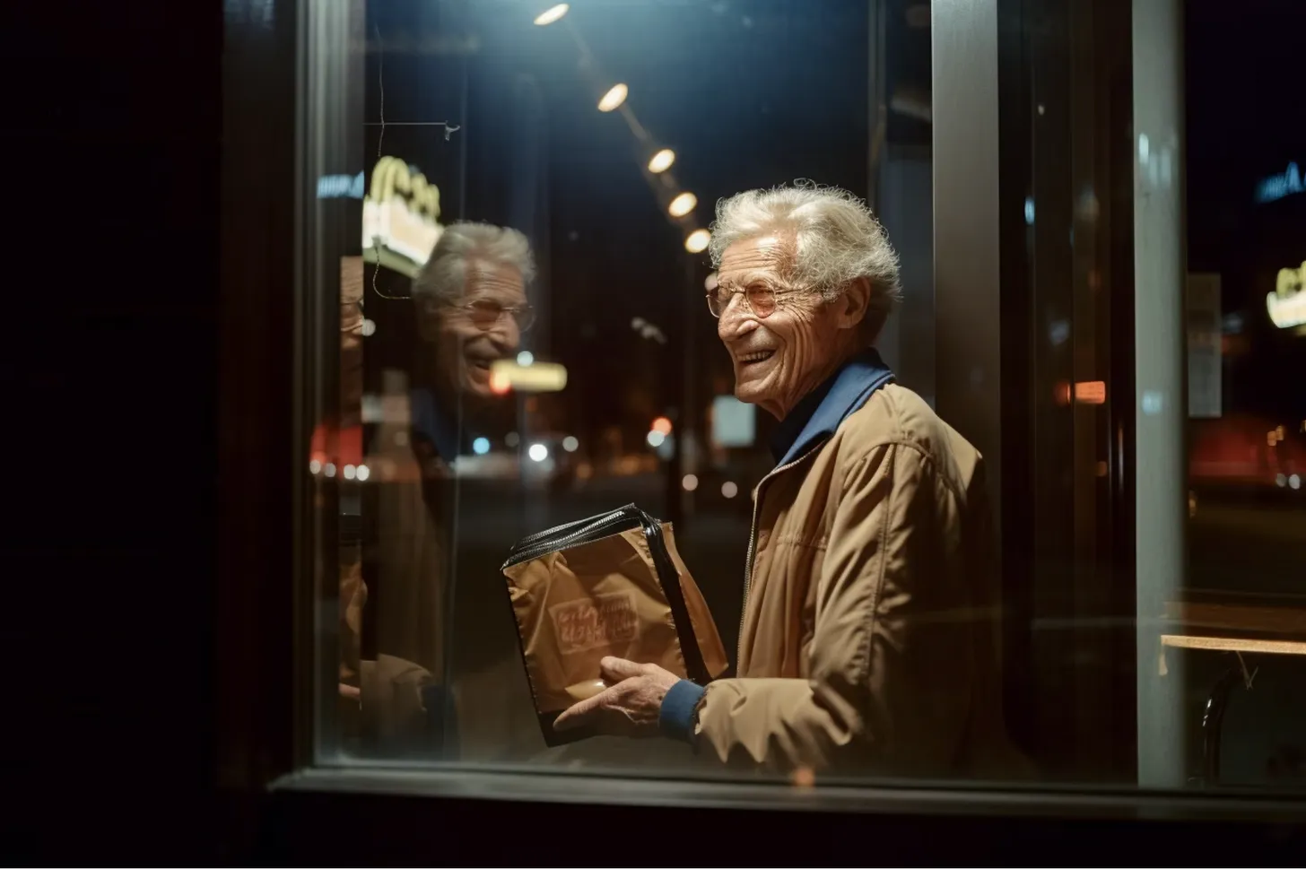
Mike Schmidt shows you a series of photographs, some taken by himself and others generated (or co-produced) using AI. He asks: can you tell which is which? Like 73.6% of others, I guessed them all correctly. But before feeling too smug it's worth noting that an AI-generated image recently won the Sony World Photography Awards.
2. The beauty of what we'll never know [Watch 9.57 min]
A TED talk by Pico Iyer.
"At some point, knowledge gives out. And that is the moment when your life is truly decided: you fall in love; you lose a friend; the lights go out."
3. Untranslateable weather [Read]
A conversation about the A Thousand Words for Weather art installation currently open in London. The artists who made it created a "dictionary" of the weather with translated words from dozens of different languages and cultures, and then "translated" these into a sonic landscape. In response to the climate crisis, we certainly need more meaningful conversations about the weather.
4. Morphology of the human eye [Read]
Humans are the only species with the white sclera (the part of our eye that surrounds the darker-coloured iris) making it more obvious what we're looking at.
5. A Little Girl Tugs At A Tablecloth [Watch: 1.48 min]
The poetry of ordinary life.
If you've made it this far, I'm sure you're going to be interested in this final shout-out. My ally and author of The Mindful Photographer, Sophie Howarth is offering what promises to be an inspiring online masterclass next month (in May). It is being supported by the street photographer I quoted earlier: Eleonore Simon. All of us in the Just Looking community get a 20% discount. Email me for the code.
It's a weird time for making sense and meaning of the world. Wishing you (and me) more humility, curiosity, and a greater diversity of stories.
Yours,
Menka
Noticing – Our Newsletter
Join our newsletter community for monthly inspiration to slow down and stay curious about everyday life and what matters most to you.


